

JW
Wow! Nice!
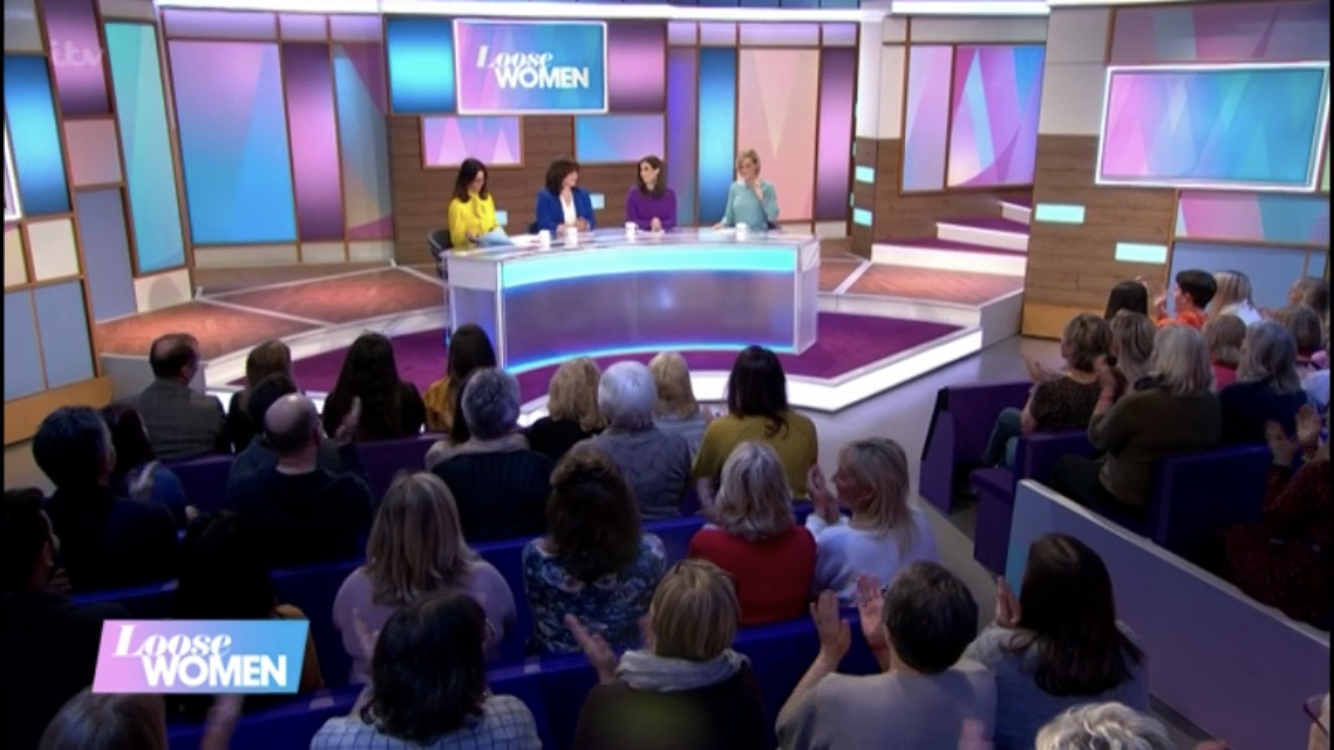
The wooden effect a throwback to the previous set in London Studios. And the overall colour pallette a throwback to the short-lived set before that.
Nice jib!
The wooden effect a throwback to the previous set in London Studios. And the overall colour pallette a throwback to the short-lived set before that.
Nice jib!
AL
Really what they needed, not a big critic of sets myself but the last one was extremely garish and had complaints from the general public on twitter which is not usual so it needed to go.
I read on twitter that Erron Gordon was involved and I wouldn't be surprised because it is fantastic overall well done to all involved.
I just hope they keep consistent, my biggest gripe was switching from everyone entering separately to 3 hosts entering together over pop music or 2 entering through the same door it was just messy. I hope they stick to the new intro consistently.
JC
That'll be because he's on the credits as Consultant Director for the show
Love the new look.
Really what they needed, not a big critic of sets myself but the last one was extremely garish and had complaints from the general public on twitter which is not usual so it needed to go.
I read on twitter that Erron Gordon was involved and I wouldn't be surprised because it is fantastic overall well done to all involved.
I just hope they keep consistent, my biggest gripe was switching from everyone entering separately to 3 hosts entering together over pop music or 2 entering through the same door it was just messy. I hope they stick to the new intro consistently.
I read on twitter that Erron Gordon was involved and I wouldn't be surprised because it is fantastic overall well done to all involved.
I just hope they keep consistent, my biggest gripe was switching from everyone entering separately to 3 hosts entering together over pop music or 2 entering through the same door it was just messy. I hope they stick to the new intro consistently.
That'll be because he's on the credits as Consultant Director for the show
Love the new look.
MR
mr_vivian
Red and Green should never be seen.
It's a lot easier on the eye that's for sure.
It's a lot easier on the eye that's for sure.
MO
That is a vast improvement over that last garish set. Im not sure how they even made it air. This is very View-esque with the transoms and internally lit elements. And it looks permanent. That last set was hideous for some many reasons. And was a waste of money. I do think there are some blocking issues and the lighting programme needs a bit of help. And the wood tone and grain that was picked has a unfortunate 70's feel to it and wood on the floor behind the desk seems to be a different colour from the wood on the walls, but that could be lighting issue. And to my eye the purple carpet somehow seems off. Im generally not a fan of sets that use purple/magenta/pink colours because I think on UK tv its used an frequently on many chat shows. But all in all, this is a vast improvement over that last garbage.